Monday, 30 June 2014

Comic review - The Ripper Legacy: A Raven Chronicles thriller

Review by Richard Williams

Published by: Tranzfusion
Author: Jim Alexander
Artist: Mark Bloodworth


I’m always a little leery of titles dabbling in Ripper territory. They rarely do justice to one of the greatest criminal mysteries of all time and seem small when cast in Jack’s shadow. Nonetheless I decided to cut The Ripper Legacy some slack and put aside my reservations.

Ripper Legacy follows the tale of a team of paranormal investigators working with the FBI to crack a murder case like none other. None other, that is, except a certain spate of murders in London back in 1888. But what appears at first to be a simple yet convoluted case of human malevolence turns into the deadliest case of their lives with more riding in the balance than anyone imagines.

What strikes me immediately about this work is the quality of the art. Mark Bloodworth is an illustrator worth watching out for. His strong, dynamic and characterful style makes maximum use of the black & white format and suits this story brilliantly. His detailed anatomical drawings are especially accomplished and plants this book firmly in the ‘not for young children’ category.

All of this could have been for nothing, however, if the author had not held up their end of the bargain. Great artwork only gets seen if the reader keeps turning the pages. I have read Jim Alexander’s work in the past and he is, for me at least, a ‘hit and miss’ writer. Imagine my relief, therefore, when I tucked into Ripper Legacy and found that this is undoubtedly one of those hits.

What has been crafted here is a suspenseful mystery with solid pacing and decent characterisation (excepting the name Edgar Allan Raven). The supernatural elements are good (when they can so easily be naff) and the dialogue is, largely, good material. The twists and turns are not out of character or lacking in sense or internal logic and I found myself scrolling down the pages quite quickly. Had I not been stopping repeatedly to admire the artwork then I would have finished much sooner than I did.

All of which being the case I find myself recommending The Ripper Legacy for anyone who enjoys macabre tales of suspense, murder and the paranormal. If Care Bears and unicorns are more your thing then maybe give it a miss.

Friday, 27 June 2014

Comic Review - Death Sentence

Guest review by Lisa 'Bathobbit' Hicks 
(Who, incidentally, is my rather amazing wife)

Published by Titan Books
By Monty Nero & Mike Dowling


Firstly, I thought that at 36 I was never able to blush again. This book made this happen.

The world we live in is pretty shitty, let’s not pretend it isn’t. The places we grew up in are not the same anymore and the people are pissed off and angry. We use photo editors to make photos look happier and inject a bit of colour into the humdrum daily toll of life or if we feel we just can’t be bothered we grey scale them. Not to put a dampener on anything but we stroll through our daily lives accepting the quiet chaos that is bubbling under the surface. The riots…they were a perfect example of how quickly this country *if any* can erupt when it needs release, benefit streets and closures of N.H.S buildings, changes in government and the degradation of moral values and the respect for a child’s innocence have all piled up into something quite filthy and like a big black shadow its making its way through the cities into out quiet cul-de-sacs and homes.

Comics have turned in that direction over the years addressing all of societies issue and hang ups and those writers and artists with big enough balls to be unpopular and the talent to translate their gripes and observations have been welcomed by the reader who yearns for that dirty realism we crave. I, myself,  have found myself wandering the aisles for something that will explode with realistic shit all over my face, I realise that sounded unhygienic but I KNOW you get the picture as I’m sure you found your way here… expecting the same.

I thought about re-reading the same old Dickens worthy hardback graphic novels that seem to be flooding in bulk and then came across a little gem that gripped on to my attention and manifested itself nicely for the ride.

‘Death Sentence’ is published by Titan Comics and written by Monty Nero with Art work by Mike Dowling and lettering by Jimmy Betancourt.

This book highlights all that is wrong with society, governments and indeed the ‘celebrity’ infestation we obsess with. The world is going to shit and we don’t need much imagination for that. Every week we seem to hear about some issue of health that is spreading like wild fire with no known cure or prevention, we still don’t have a correct response to H.I.V . Death Sentence chucks another into the mix, The G+ virus.

The G+ Virus is your clocking out card but man you are going to go in style. I think I might want to go out this way. It’s not pleasant but at least I get to be something different for 6 months! It is a sexually transmitted disease that is rife among the “Britain’s hardest club towns” culture roaming free all over ITV2.  Sexual liberation has brought with it some consequences and you have two choices. Sit there and mope…or do something about it.

Once affected you begin to show extra normal abilities and this story follows three quite fucked up main characters all of which are hugely developed and relatable. In my mind I had a vision of who they reminded me of and once there I couldn’t shake it off.

I don’t want to give too much away but the sheer honesty of it all is overwhelming. The first pane is brutal and it’s all up hill from there. I have always felt sorry for the Pete Docherty’s of this world and not so much the Russell Brands *wink* and I saw them slapped all over this. They all have a price to pay for such a shitty use of life and now they are paying it. It’s almost like the devil has come collecting and all those who pished their life away are now being called up to Hell's Gates. You want to like them you really do and you see so much more for them but the layer of self is always quite hard to break through.

Verity.  I like her; she has some amaze balls body ink. She is our young heroine *I’m not sure that’s quite the right word, her ex hates her but she is more or less getting on with it with gusto* A graphic designer who has made a stupid mistake. This mistake has led her down the G+ route and gifted her with a little extra kick. The one that can be reasoned with and the one who wants to make a difference, our bit of hope.

Weasel. I wanted to give him a bath but that is the mother in me. A Docherty like character whose record label drops him quite willingly when they could no longer profit through his imminent death.  Its not uncommon to see music celebrities misused and ruined by record labels and forced out with a level of popularity that it quite literally backfires morally and mentally. The one thing in life Weasel takes seriously, because let’s face it...he sucks at music, is his son. And this is a redeeming quality.

And let’s move on to our Anti-Hero…Monty *shudder* it has been a long time since I genuinely feared the ‘What if’ of a comic baddie. There are several key points in this project in which I sat open mouthed, the nun…the queen! One truly fucked up life that he doesn’t question as a catalyst only the way he wants to go out.  A misguided notion of helping  ‘free’ the people reminds me of the current wave of self-obsessed celebrity parading through comic circuits and t.v shows becoming the very thing they say they despise.

Criticising religion and politics and encouraging rebellion and parades of anger, it’s ok to chuck a t.v through a shop window and steal a bag of rice because your only doing what you feel is right! I won’t lie I thought about Russell Brand through all of this and whilst he can write a book dismissing his past because he has visited a guru in India, married a pop star then divorced a pop star all whilst doing some crazy arsed magniloquent Yoga positions is jaw dropping and infuriating. But we listen, we listen and we agree and when he posed the idea that perhaps we should all not vote…I almost found myself agreeing…UP THE ANARCHY!

Let’s face it. We all have thought about what we would do if we have a month to live. I personally would fuck up my works health and safety record of 456 days without an incident. I would then probably run up a bill on a credit card with Mickey Mouse. Chuck a bit of the super power life in with that and oh my god…I would be in heaven. I would choose to make a difference and this book makes me question just what that difference would be? If I had the power to make things better how far would I go and would I care if you disagreed?

The book is littered with great adages to suck you right into the world in which this virus exists the artwork is sublime and the attention to detail is a perfectionists wet dream. The replies, bubbles and dialogue of all characters and extras were spot on, poetic and flagrant. If you’re a screamer or prude then this is not the book for you but if you appreciate a modern comic from a team of modern artists and writers then my god you will love this book as much as me.

My collection is richer for it and my eyes are open wider.

Tuesday, 24 June 2014

Nostalgia crept up on me and kicked me in the nuts

And it really made my eyes water.

I've been sorting my meager RPG collection and I had a long look at the book The Citadel of Chaos, a Fighting Fantasy adventure and the first ever gaming-related thing I ever bought. I had a good read of it and then went through my gamebook collection and my tabletop collection. The look, feel and even the smell of the books and boxsets took me back and I (mostly) remembered how I felt when I played these games and the fun I had with them.

As I thought about the first time I ever sat down and did a seriously intense session of Warhammer Fantasy Roleplay 1st Edition it suddenly hit me; all those first games I ran, all those enjoyable learning curves I had to go through to get the most out of the game system, all those moments I experienced when I first realised how best to run a game, or how to make the story work, or all those first times when everything came together and the group really clicked and the game flowed and the immersion was complete...

I'd never experience any of those moments ever again.

That first magical moment when I found out that I could adventure in the pages of a gamebook and I felt that I was truly exploring a dangerous, mysterious castle. I got all excited and nervous when making my choices and felt dismay when losing a battle or making the wrong choice, and elation at the right ones.

Whe I first sat down at D&D club at school and created, with some level of confusion, a thief. That half excited/half nervous first game, the amazing sense of accomplishment when defeating my first RPG foe and the contentment and feeling of accomplishment when my first gaming group completed the adventure.

Buying the red-box Basic D&D and going through every book, rubbing the wax crayon on the dice and reading the books again and again to make sure I understood what the game was really about, which was something I didn't fully understand for a long time.

I'll never experience that ever again. The games I design these days where it's a good 'ol fashioned dungeon bash, and I created a map filled with improbable monsters in rooms for no reason; I was trying to recreate the first games of my hobby. trying to recapture what it is that got me into gaming in the first place. But it'd never be the same. I've got the memory of how I felt when I first rolled the dice or experienced the adventure, but I'd never be able to truly feel that wonder again. I could have fun with my games, but I could never experience the strange mix of confusion/amazement/excitement I remember from those first days, when I was exploring those dungeons and fighting those foes and saving those townsfolk, before it became about mechanics and rules, when we didn't care about game balance and just wanted to roll dice and kill nasties.

And all the games that came after - Star Wars, Warhammer FRP, MERP, Cthulhu, all those games in which I entered a new world with new rules and experienced a new facet of roleplaying games, or created new worlds, or learned new skills to improve my playing and GMing skills to improve my hobby... I'll never get to do that again.

I still like to game and I still like to create, but for more than a decade I've not done anything in the hobby that has amazed both myself and my gaming group in such a way that got me excited, exhilarated and energetic about the hobby. I play, I try new things and I enjoy the game, but I'm not doing anything new I'm just doing new variations of old experiences. I have this sense of 'I've tried this before' or even 'been there, done that'.

That makes me really sad.

Monday, 23 June 2014

Book review - The Hobbit: An Unexpected Journey, Chronicles: Art and Design

Review by Richard Williams.

The Hobbit: An Unexpected Journey, Chronicles: Art and Design is a busy little book. Every page is crammed with so much art there's hardly a spare millimetre of blank page anywhere so in terms of pictures per pound this is already a savvy purchase. Anyone who has bought any of the concept art books for Peter Jackson's original LOTR trilogy will be pleased to see that the layout is much the same as those other titles and will be even more pleased to see a continuation of the art style as Alan Lee and John Howe are back in charge of art direction. Fans will no doubt be thrilled to see their distinctive sketch art adorning a Tolkien adaptation yet again.

The character and monster designs, as well as the environmental concepts, are all very inspiring and I can't get enough of the attention to detail. I would even go as far as to say that the character design, in particular, is superior to the original trilogy work, especially the works of Nick Keller and Paul Tobin. Anyone out there who needs some inspiration for a character in a fantasy setting would be well satisfied with this book. Another name I will be looking out for in future is Gus Hunter whose conceptualisation for the battle between Dwarves and Orcs from Thorin's past I would pay handsomely to own as a framed print.

As you would expect from a special effects house such as Weta there is a great deal of attention to detail and this is well represented in the book. There is enough weapon and armour designs to fill a virtual armoury fit for an army and any little tools, gadgets and props carried by the characters are included.

There are, however, a few niggling gripes. Firstly the book has been produced in landscape format, rather than portrait so it doesn't sit so well on the shelf next to my other books. I would have appreciated it if the book had been made like the other LOTR concept art books, not just for the sake of my shelving aesthetics, but also so that it fit better with the books that had come before. As a lover of art I don't often ask for stagnation in design and production but as a collector I appreciate continuity.

There is also a fold out recreation of Thorin's map, attached to the inside front cover and attached to the back cover is Bilbo's burglar contract. Both are nicely made and stylish but they aren't perfect. The map has the invisible writing, visible only under the correct moonlight, which has been done with glow-in-the-dark lettering but sadly it is clear as day in normal daylight. Do I expect too much? Maybe. Do I know anything about producing luminous lettering on a stylish Dwarven map? No. But was it the first thing I thought when I saw the map? Yes. Which is a shame. As for the burglar contract it has been made a little too small and is difficult to read. Not impossible, just not easy. Again, a quick caveat; You might have the eyes of a hawk and therefore not have any difficulty reading the writing. I, sadly, do not and therefore do. However it is worth stating that it's nice to see them at all.

So who could possibly want to buy this book? This hardly needs stating but fans of Tolkien will eat this up and love every second of it. Lovers of concept art and fantasy art will also fall in love with this book, as I have.

Thursday, 19 June 2014

5 years old today!

It's hard to believe, but today is the fifth anniversary of this blog.

I originally started the blog to blather about gaming and swear a lot in a cool and edgy way, but it turned out that I didn't need to be abusive or controversial, I just needed to talk about games. Over the years I've met plenty of fun and interesting people, opened some doors and made new friends. It's been a crazy and incredibly enjoyable journey.

I've yet to reach the destination.

I was looking at my old banners and I found my original header. It wasn't terribly exciting and I changed it plenty of times - I either tried to be sharp and concise or flashy and colourful - but I like the banner I have now.

My original banner

I'm still having a good time and now that I cover a lot of different aspects of the science fiction and fantasy genre and I've got some fellow hobbyists involved, so there's plenty of potential for the blog. I think I might go out and have some cake. And, possibly, a beer.

Happy 5th Birthday to my blog!

Book Review - The Art of Wolfenstein: The New Order

Review by Richard Williams

by Machine Games

Published by Dark Horse

I didn't know what to expect when I pre-ordered The Art of Wolfenstein. On the one hand it was being published by Dark Horse, the people behind some excellent concept art books (such as Remember Me and Mass Effect), but on the other hand I didn't know if I liked what I was seeing about the upcoming game. So it was with some trepidation that I opened the book. But man, oh man, am I glad that I bought The Art of Wolfenstein. Straight away, just by flipping through the pages, I could already see that this was going to be one of the better items on my concept art bookshelf. For starters there is such an abundance of fantastic art on display here. This is one of the areas where Dark Horse really excel with their artbooks, giving pride of place to the art itself rather than reams of text, and once again they have produced something really quite special.

The areas covered in this book are as you would hope and expect to see; Character designs, level designs, key art, and plenty of weapons and vehicles. Added to this is all the design work for the world itself including everything from gadgets to posters and even door locks. Interestingly what they have done this time, however, is to place the chapters in the order of the levels of the game. The contents list in the front of the book is broken down into 'Art of level 01', 'art of level 02', etc, ending with the last chapter: 'Marketing art'. I like this approach because it means you are introduced to all the elements of the game in the order in which they appear, rather than just lumping everything together by category. This would come in handy if you wanted to get the book but didn't want any spoilers whilst playing the game and could therefore read the book as you progress through the levels. Would anybody actually do that? I don't know but if they wanted to they could.

It's hard to say what I like most about this book. I'm leaning fairly hard in favour of the location designs. Firstly because there's so much of it (as you should expect from an artbook about an FPS) but mostly because it is fun to look at. I have already looked though this book three times and I know I'm going to be looking through it a good number of times more because the art draws you in. I would even go as far as saying that it is exciting to look at. It is also almost entirely detailed colour work (although the city sketches are superb) and none of the pieces are so small that you can't get a sense for the details. It makes me want to take a walk in the Nazi Berlin they have envisioned. Seriously, cities should be built this way.

But really, picking a favourite feature about this book is a futile game of nit-picking. Why futile? Because you would have to be pretty damn stringent in your marking to find anything wrong here. Maybe you're the type of person who likes to see a lot of information from the creative talent about what they've drawn, in which case you might wish the book was a little wordier, but I really like the minimalist approach to explanations. A hundred words is about the limit to any caption contained herein and most are much shorter and I favour that style.

So in conclusion: do you want this book? Yes! It is superb. The art is of the highest quality, the book itself is of the highest quality and the subject matter is interesting and fun. Anybody looking for inspiration regarding evil technologically advanced Nazis may look upon this book as the only visual source material you'll ever need. If you're a lover of concept art books then there is no way in hell that you don't want this book. If you don't like concept art books.... why are you reading this review?

Saturday, 14 June 2014

Book Review - Airship Shape & Bristol Fashion

Published by: Wizard's Tower Press
Edited by: Roz Clarke and Joanne Hall


I'd heard a few rumours about a book being funded by the BristolCon Foundation, a charitable organisation that runs the BristolCon SF & Fantasy convention - which takes place in Bristol every October - and here's the result of their labours, and their first short-story anthology to help promote local writers and artists.

Airship Shape & Bristol Fashion is a collection of short stories set in and around the city of Bristol and they all share a similar theme - they are all written in the genre of 'steampunk', a genre that I'm familiar with but have never looked into with any seriousness. ASBF is my first proper dive into this popular and ever-expanding alternate history setting, so would this book turn me off it or draw me into the world of brass, steam and technology?

The book is made of three sections covering three themes;

Less Than Men, covering stories such as slavery and the slave trade and how it affects individulas, societies and perceptions of freedom and property. My favourite story in this section was 'The Lesser Men Have No Language' by Deborah Walker which challenges preconceptions. It ends rather suddenly and I was left feeling that there was more to be said, but it's a good story that made an impression on me.

Lost Souls has a much more supernatural and mystical slant to it. These are dark and somewhat brooding and there's a hint of horror in there, but they are a great collection of tales you'll want to read on a stormy night in front of a crackling fire. My favourite story here was 'The Girl with Red Hair' by Myfanwy Rodman and it certainly kept me hooked from the first sentence to the very last.

Finally there's Travelling Light that is, basically, a collection of action adventure stories. 'The Lanterns of Death Affair' by Andy Bigwood was my favourite story in this section as it's a good tale blending adventure, steampunk and alternate history.

So, what has this book done for me? Has it made me a steampunk fan? Well, yes and no. While it hasn't made me want to suddenly start a huge collection of steampunk paraphernalia and delve into the genre a lot deeper, it certainly has made me appreciate it a lot more and fully understand what it is that people enjoy about it. I will be looking a little more into what steampunk can offer and see what else I can get out if it.

I enjoyed the stories here and found them fulfilling and thought provoking. Most of them hit the mark for me and even those that didn't were a good read. In all, there are plenty of stories covering plenty of different ideas, styles and moods so there's a lot of material that'll suit most fans of the steampunk genre. I can easily recommend it.

Contents:

Case of the Vapours, by Ken Shinn
Brassworth, by Christine Morgan
The Lesser Men Have No Language, by Deborah Walker
Brass and Bone, by Joanne Hall
The Girl with Red Hair, by Myfanwy Rodman
Artifice Perdu, by Pete Sutton
Miss Butler and the Handlander Process, by John Hawkes-Reed
Something In The Water, by Cheryl Morgan
The Chronicles of Montague and Dalton: The Hunt for Alleyway Agnes, by Scott Lewis
The Sound of Gyroscopes, by Jonathan L. Howard
Flight of Daedalus, by Piotr Åšwietlik
The Traveller’s Apprentice, by Ian Millsted
Lord Craddock: Ascension, by Stephen Blake
The Lanterns of Death Affair, by Andy Bigwood

Hopefully this is a sign of things to come and the BristolCon Foundation is already planning their next collection.

Thursday, 12 June 2014

The Diana Jones Award nominees


SHORTLIST FOR 2014
DIANA JONES AWARD ANNOUNCED

Two publishers, a hobby game, a family game, and an RPG vie for hobby-gaming’s most exclusive trophy

From a long and extremely diverse long-list of nominees, the secretive committee of the Diana Jones Award has distilled a shortlist of five items that it believes best exemplified ‘excellence’ in the field of gaming in 2013.

The Diana Jones committee is proud to announce the shortlist for its annual Award for Excellence in Gaming:

Evil Hat Productions, a publishing company run by Robert Donoghue and Fred Hicks

Ever since the release of FATE as a free RPG in 2003, Evil Hat Productions has aimed at two usually difficult goals: skill and elegance in game design, and professionalism and transparency in publishing. Honesty and openness about business realities, and excitement and perfectionism about game possibilities, built the Evil Hat audience from a corner of the Internet to a loyal horde numbering in the tens of thousands. From Don't Rest Your Head through Happy Birthday RobotPenny For Your ThoughtsDiaspora, and Swashbucklers of the 7 Skies, Evil Hat has combined the key features of a design house and a best-of-breed imprint while nurturing its core FATE system through three major editions without forking its player base. By co-creating Bits and Mortar, Evil Hat pioneered PDF-retailer cooperation; using the Open Game License and Creative Commons, Evil Hat built on a tradition of trusting players and designers to build better games. In 2013 Evil Hat hit both its design goals and its deadlines with FATE Core: five books Kickstarted, printed, and delivered, and over 60,000 copies sold. And FATE Core is still a free RPG.

Hillfolk, a roleplaying game written by Robin D. Laws (Pelgrane Press)

The Hillfolk Kickstarter asked for $3000 and offered a 96-page softcover; it raised $93,000 and delivered two full-colour hardbacks filled by some of the brightest names in story-game design. But it only happened because of the game-engine at the heart of Hillfolk: Robin D. Laws’s DramaSystem, an elegant and clever take on group storytelling that puts gameplay and competition on an equal footing with structured narrative and individual creativity. Hillfolk and its sister-volume Blood on the Snow showcase a leading ludonarrative designer at the height of his powers, and inviting his friends to come and play.

Paizo Publishing, a publishing company run by Lisa Stevens

One of the hardest things in business is to unseat a market-leader, particularly when that market-leader created the entire field, but 2013 was the year when word spread that Paizo's Pathfinder RPG was outselling Dungeons & Dragons.It’s official: Paizo has used the OGL and a single-minded commitment to talent and quality to create a better D&D than D&D. Its achievement only seems extraordinary to those who don't know CEO Lisa Stevens’ extraordinary track record in the games industry, from Lion Rampant through White Wolf and Wizards of the Coast. Paizo's ability to raise $1m to crowd-fund a Pathf inder-based MMO in January 2013 was simply the apple at the top of the industry's new tallest tree.

ROFL!, a family card game designed by John Kovalic (Cryptozoic Entertainment)

In game design nothing is harder than simplicity, and in no category is that quality more required than in the family/party game space. With the brilliant, elegant and delightful dynamic animating ROFL!, designer John Kovalic provides a masterstroke of the KISS principle. Just as amazingly, he does it by finding an original take on the word game sub-genre. ROFL!’s phrase compression conceit rewards both clue-making and guessing, supplying an essential skill-levelling element many party games lack. And if that weren’t enough, he somehow inveigles tabletop’s most beloved cartoonist to lend it the light, joyous visual look that its play style demands. Though created by someone steeped in the adventure game tradition, it could and should appear on shelves at mass-market retailers wherever they are found. GRTGMJK!

Terra Mystica, a strategy board-game designed by Helge Ostertag and Jens Drögemüller (Feuerland Spiele/Z-Man Games)

In the land of Terra Mystica dwell 14 different races in seven landscapes, each bound to its home environment. Each race must terraform neighboring landscapes into their home environments in competition with the others. It's a brilliant piece of state-of-the-art design: there are no stunning new mechanics here but the game takes a number of clever, intriguing systems and combines them in a bravura piece of game-creation to build a sublimely engaging experience.The game emphasizes strategy over luck, rewards planning, and provides a huge amount of delightful replayability.

PRESENTATION

The winner of this year’s award will be announced and the Diana Jones trophy will be presented at the annual Diana Jones Party, which will be held in Indianapolis at 9pm on August 13th — the night before the Gen Con games convention opens to the public. All games-industry professionals are invited to attend.

ABOUT THE AWARD

The Diana Jones Award for Excellence in Gaming was founded and first awarded in 2001. It is presented annually to the person, product, company, event or any other thing that has, in the opinion of its committee, best demonstrated the quality of ‘excellence’ in the world of hobby-gaming in the previous year. The winner of the Award receives the Diana Jones trophy.

The Diana Jones Committee is a mostly anonymous group of games-industry alumni and illuminati, known to include designers, publishers, cartoonists, consultants, and some content to rest on their laurels.

Past winners include industry figures such as Peter Adkison and Jordan Weisman, the role-playing games Nobilis, Sorcerer, and Fiasco, the board-games Dominion and Ticket to Ride, and the website BoardGameGeek.

Last year's winner was Wil Wheaton's webseries Tabletop. This is the fourteenth year of the Award.

Special thanks to the sponsors of this year's Diana Jones Award ceremony, who will be announced shortly.

Tuesday, 10 June 2014

Book Review - The Art of Watch Dogs

Review by Richard Williams

by Andy McVittie

Publisher: Titan Books


Anyone who has read my previous reviews will know that I speak highly of Titan Books, the publisher of The Art of Watch Dogs, and once again they have created a solid offering. However I can't say that this is their finest concept art book and, unlike with previous books such as The Art of Assassin's Creed 3 and 4, I found the deficiencies quite glaring. But that's not to say that this is a bad book. There is still much to like and I'm not unhappy that I bought it.

The book is broken down into four chapters; characters, locations, 'The Underground', and 'everything is connected' (dedicated to the hacking side of gameplay). Of the four chapters it's the locations which dominates, both in terms of quality and in sheer quantity. Roughly twice the size of any other chapter it is also this books most enjoyable section and, I feel, even its saviour. But to begin the first chapter, 'Dramatis Personae', is a straight forward highlight of key characters. There is a lot of wasted space in this chapter which could have been used to show the development of what are, I'm sure, very interesting characters. Sadly what is included is almost entirely finished 3D renders with only a tiny amount of 2D work (my personal favourite). The handful of key art pieces are welcome but aren't enough to save this section from feeling like a disappointment. Less graphic design work and more character design is what's needed here.

Then we're on to the location work which is, I was relieved to see, excellent. While there is still a fair amount of unused page around a number of the pictures it is far less of a problem throughout this chapter than the rest of the book. There's a great mix of locations here from the historic to the futuristic and both types display this books best art. The contrast between pristine and grimy helps to give this vision of a future Chicago a more realistic edge and you can tell that the artists had fun with their subject matter. I particularly enjoyed 'The Mad Mile' and 'The Loop', which nicely show off the polar extremes of developed and deteriorating. However I find myself most drawn to 'The Wards' and 'The Docks', the really seedy areas. These kinds of places require design that has a real breadth and depth of detail and it makes for much richer art, when done properly, which this most certainly has been. There's also a small selection of logos and signs included within the locations section which rounds it out a little better.

The next chapter, 'The Underground', is both hard to describe and something I personally didn't like. More like a graphic designer's resource book than a concept art book this section is filled with the signs and symbols that can be discovered throughout the game which are related to the underground hacktivist group 'DedSec'. This book couldn't really not include this section, since it is a key part of the game, but it's not the kind of art that I enjoy.

And lastly we have 'Everything is Connected' which is all about details regarding the hacking elements of the gameplay. However, aside from a couple of key art pieces and some designs for items which can be hacked, this is almost entirely a selection of screenshots from the game. Therefore I think art lovers won't find themselves well served here.

So how to conclude? Clearly there is plenty to find fault with here; the unused spaces, the heavy graphic design elements, concluding on screenshots, and the lack of detail and design development of the characters. But there are also some parts of The Art of Watch Dogs which work very well. The location work is outstanding, vibrant and very enjoyable, not to mention abundant (which I seem to have mentioned a few times). The descriptive text is also good; unobtrusive, clear, and succinct throughout the book.

So who would most enjoy this book? Lovers of location art will find plenty to appreciate here. People who work in graphic design might also find the work here interesting as a reference book. But really, aside from those two groups, I'm not convinced many people will find this offering ticking too many boxes. More for the collectors than the casual appreciators of concept art.

Sunday, 8 June 2014

Advanced Fighting Fantasy: Science Fiction

And so it begins. Again.

Last year I began work on the sci-fi rules version of the Advanced Fighting Fantasy rules from Arion Games. This was to be a stand alone rulebook encompassing the science fiction gamebooks of the Fighting Fantasy series.


Sadly, other project commitments on both my side and Arion Games meant that the project was put on what we thought would be an indefinite hiatus, but recently I put out my first-draft basic rules and notes to see if there was any interest - and there certainly was. After a brief meeting with Arion Games it has been decided to release the rules as a supplement to the original core AFF rulebook, and basically add plenty of material to give players a sci-fi option to their games.As before, my first job is to make sure that this game would serve as a decent addition to the core rulebook, familiar to players yet with enough material to make it worthwhile.

My primary work will be the setting itself. Fighting Fantasy has Titan: The Fighting Fantasy World as it's playground and the majority of the books were set in,or made part of, this fantasy world. The science fiction gamebooks didn't have a campaign setting; they were all in different places at different times doing different things. So, I have to create a campaign setting called 'Titanreach', in which most aspects of the science fiction gamebooks will be represented, from starships to lasers to psionic powers to post-apocalyptic wastlelands. This, I think, will be the largest slice of the work. I already have some ideas but it's hanging it all together that's going to be the issue. For now I'm going to take my cues from Starship Traveller, as this was the first sci-fi gamebook, and that's as good a starting point as any.


Watch this (deep) space.

Thursday, 5 June 2014

Review: THE GAEAN REACH: The roleplaying game of interstellar vengeance

Review by Richard Williams

Published by: Pelgrane Press
Written by: Robin D. Laws

A no-frills gritty sci-fi adventure game using modified GUMSHOE rules and based on the fiction of Jack Vance.

The Gaean Reach satisfies most of my cravings for science-fiction adventure fun. While I will confess to being a devotee of space opera, something this game makes clear it is NOT, I cannot deny that I’m a typical Brit in my appreciation for cheap and gritty fiction.

Right from the start I found myself enjoying this publication. The writing style is fluid and easy to get along with while the layout is easy on the eye. The introduction makes it clear what this game is setting out to accomplish and what players should expect. I was surprised to find it said almost straight away that players will not find anything about space combat here and that space opera was not on the menu but rather a GUMSHOE adventure with a difference. That suits me down to the ground as I’m always happy to launch an investigation regardless of the setting, be it a Cthulhu death trap or dungeon based fantasy involving dragons in some way. While I’ve never read any Jack Vance novels (something I shall be seeing to in no great space of time) from what I can see here I’m not going to be disappointed as far as setting goes.

Once the introductions and basic outline are out of the way it launches into that old first chapter staple of character creation. I’m glad it does because this is the only area of the rules which gave me any problem and by discussing it first I can clear any misgivings early. What we have here is intended as a very basic character creation system, and I suspect it becomes much easier with practice, but I didn’t find it intuitive and that makes it complicated. It’s a multi-tiered process involving dishing out cards, trading cards, adding points, then swapping points, and various other elements which I can’t claim to have fully understood on just a couple of read-throughs. Like I say, I’m willing to bet that this is a piece of child’s play once you’re used to it, or see it being done, but on a simple reading of the text I find myself with questions. This is partly down to the way this book is written which, though lovely to read, can lose you a little in the prose. A crystal clear bullet point system of ‘do this then do that’ would have been a great help rather than sentences like “as they transfer the numbers, they can adjust them somewhat”. While that sentence is explained a little further on I’d have preferred it not being there at all.

Thank heavens for Skulduggery, a completely unrelated RPG, whose rules have been put to use here for an alternative ultra-simple randomised character generation. For some reason those rules are not included with the main character generating section but are found on page 75 under the heading ‘Scratch-Built Characters’. These rules work as a simple point-spend system and allow for a high degree of control of where those points are spent (making me ponder the supposed randomness of the ‘random character generation’).

With uncertainty over the character creation process put aside this rule book cracks on nicely. The next section moves onto the core mechanic of investigation and players accustomed to the GUMSHOE system will find themselves on familiar territory. Basically there are a number of skills which represent the different forms and specialisations of investigation, from knowledge of Anthropology (identifying artefacts from living cultures) to Scuttlebutt (gathering info from crowds and swapping gossip), and this list is very comprehensive allowing for just about any form of investigative approach. You want to beat the information out of someone? Fine. You want to work the bureaucratic system? No problem. Fancy getting the dirt out of someone with a wink and smile? Flirting’s the skill for you. Or perhaps you’re the scholarly sort who will study anything from rocks to rocket science? fret not, you’re covered.

On top of the investigation skills are the more generalised skill sets for everyday adventuring such as athletics, gambling, medicine, etc. which complements the other skills nicely and provides plenty of scope for a well-rounded adventure. Players should have no problem doing whatever they want and really personalising their character (which I suppose is as much a mission statement for any game as an observation of this one).
One element which was new to me, another borrowed rule, this time from The Dying Earth Roleplaying Game, is the ‘tagline’ system. Basically there are a number of phrases which are cut out and handed randomly to players by the GM. During the game the players are supposed to find a way to incorporate that phrase into their dialogues and if they manage to do this then they are rewarded by tokens. The better the phrase fits (rather than just jammed into a conversation awkwardly) the more tokens it is worth. Those tokens can later be traded for special perks. I like this system because it not only adds another way of rewarding players for good roleplaying but also keeps the game true to its source material. The words and phrases have been take from the novels by Jack Vance and by using them it helps to put the players more firmly within that fiction. It’s therefore ideal for games based upon books, TV, and film (or any pre-existing source material).

Moving on to setting notes and material for the GM I was pleased to see that details were plentiful yet succinct. Key groups, places and organisations are covered in short but informative sub-sections and while it is clear that a background knowledge of Jack Vance’s work would be beneficial it is not absolutely vital.
For the GM’s convenience there are also a number of opponent stats which have been pre-generated but while they are broad there isn’t a great number of them. In fairness this is partly down to the setting since there are no advanced alien civilisations within this work. If you’re talking to someone then that person will be a human. The only aliens you will encounter are animals and the examples given are generalised enough to be applied to almost any creature the GM might devise.

There are also a number of tips and prompts for the GM, an explanation of the ‘scenario’ method of adventure building as well as a sample scenario set-up. All in all, very handy indeed. Thrown in with all of that are alternative ‘frames’ for gamers to use. What is meant by this is that you don’t necessarily have to play a game of interstellar revenge but instead can play with other reasons for interplanetary gallivanting such as space trading.

As if all of this weren’t spoiling the GM enough already there is also an introductory adventure. Now I know that this isn’t exactly a ‘special feature’, par for the course, even, but it’s worth noting because while it might not be anything special to have an introductory adventure it can be a serious oversight to not have one.

The book concludes with all of the various sheets which are required so GMs can just print off and play. I was pleased to see how few sheets this actually entailed. The nature of the system means that there are no complex star charts or deck by deck ship stats to calculate or… well, almost anything else other than the character sheets and the cards for character creation (including the taglines).

So what to make of this PDF rules book? Aside from what I feel is a clunky character creation system I’d say this is a dead simple, easy to learn, quick to play science-fiction romp well worthy of a few evenings and weekends of your life. The information is, largely, well presented, the interior artwork is basic but appreciated and the layout sticks to the popular and easy to absorb chapter organisation.

But most importantly this book makes me want to play the game. As to whether or not you’d like it? Well, as one tagline puts it: “A true scientist would not hesitate to use his sense of taste”.

Tuesday, 3 June 2014

Review - The Eye of Winter's Fury: Destiny Quest Book 3

The Eye of Winter's Fury - DestinyQuest 3Review by Richard Williams

By Michael J. Ward

Publisher: Gollancz

I'm going to start by saying that this is an impressive looking book. At over 700 pages long this is quite the weighty tome and people who are new to this type of adventure book might even be a little intimidated by it. Good old Fighting Fantasy looked doable whereas Destiny Quest challenges you to try. And it's a challenge worth taking.

Very quickly you can see why the book had to be so large. Other 'choose your own adventure' books kept simplicity at their core and trimmed down the excesses of regular RPGs. Destiny Quest says 'to hell with that' and crams the book with as many RPG elements as it can whilst still keeping the core mechanics surprisingly simple. The rules section is a mere 13 pages long and in that space tells you how to fill out your character sheet, undertake combat, manage your inventory, explains the key characteristics (Speed, Brawn, Magic, Armour, Health), special abilities, undertaking different quests, as well as character classes and careers. That's right, character classes and careers. Gone are the days of 'here's your fighter, go out and fight this specific bad guy'. Now you can decide if you're going to be a warrior, rogue or wizard and during the adventure(s) you can change your career, if you get the correct training, which gives you special bonuses.

You also read correctly when I mentioned 'undertaking different quests'. The book is broken down into two acts and in the front and back covers of the book are colour maps for each act. On these maps are colour coded shield symbols with a number next to them. The colour indicates how difficult the quest is while the number tells you where to turn to in the book. So while there is a central quest to complete there are also a number of sub-quests. Those 700 pages suddenly seem quite trim.

Character customisation is also well handled with this book. Between the class and career choices, as well as the massive selection of items to keep or discard, there won't be many readers with a character identical to anyone else's. This comes in particularly handy because Destiny Quest supports a kind of multi-player where several people can make a team (or even fight against one another!)

The dice required for combat and tests are D6 so those without a rack of multifaceted dice don't need to worry about not being able to play and there are no complicated tables needing referencing. In fact the combat is very much like the old Fighting Fantasy game books and involves rolling for your character, as well as the creature(s), and adding a relevant stat. There are also special abilities but those are explained with each encounter so you don't need to keep flipping back to a rules page each time you come across an enemy with a venom attack (or some such thing). If you do have a special ability yourself and forget what it does then you can quickly check the (very handy) glossary at the back of the book and then write it down on your character sheet.

Yes, of course, you will need a character sheet. You can either use the one provided in the front of the book or go online and download one because another great thing about Destiny Quest is the online support. There are a number of free downloads available, including item lists and the core rules, and it's great to see the creators put a lot of effort into supporting the players. There are some mainstream RPG companies (naming no names) that could learn a lesson or two from the folks of Destiny Quest.

However there is one gripe I must mention (but really only one). One of the key features of gaming books such as this is the notion of 'making YOU the hero'. References to the player should be generic and non-gender/race/age specific so that the reader can easily imagine themselves undertaking the quest. But with The Eye of Winter's Fury you are given a character, a young prince, which I feel is not an inconsiderable misstep. Female readers are obviously the ones most at odds with this but I also don't appreciate being told who my character is, no more than I would if I were rolling up a D&D character. For a game which boasts considerable customisation for the reader's character this flaw is quite a glaring one.

But all in all I find myself very impressed with Destiny Quest. It has managed to considerably increase the size and scope of the much-loved adventure game book format while still keeping it quick and simple to use. The online support and inclusion of team play is exactly what is needed in the modern market, with its focus on computer games, to tempt younger readers to give it a go while overall staying true enough to the old Fighting Fantasy books to keep older players happy.

If you're an old fan of Fighting Fantasy or want to introduce a younger reader to the world of gaming books then it would be hard to find a better purchase than Destiny Quest.

You can read a recent interview with the author here.

Monday, 2 June 2014

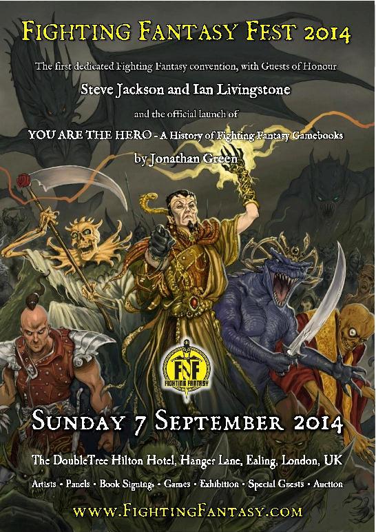
Fighting Fantasy Fest 2014 - a day dedicated to Fighting Fantasy

The first dedicated Fighting Fantasy convention, with Guests of Honour
Steve Jackson and Ian Livingstone
who will be giving a talk on the History of Fighting Fantasy.

Fighting Fantasy Fest 2014 will also feature the official launch of
YOU ARE THE HERO – A History of Fighting Fantasy Gamebooks
by Jonathan Green
as well as 
Fighting Fantasy Artists Russ Nicholson, Chris Achilleos and Tony Hough, Panels, Book Signings, Games, a Fighting Fantasy Exhibition, Special Guests, Trade Stands, and a Fighting Fantasy Auction.

Sunday, 1 June 2014

Interview - Royd Tolkien

It was an extreme pleasure for me to meet and interview Royd Tolkien - the great grandson of JRR Tolkien - at the Sci-Fi Weekender 5 in March 2014.

We spoke about a few things in the time we had, and he was a very generous, polite and decent guy who had a lot of time for people. It was a pleasure to meet him - as well as a pleasure to have him sign my anniversary edition of The Hobbit!